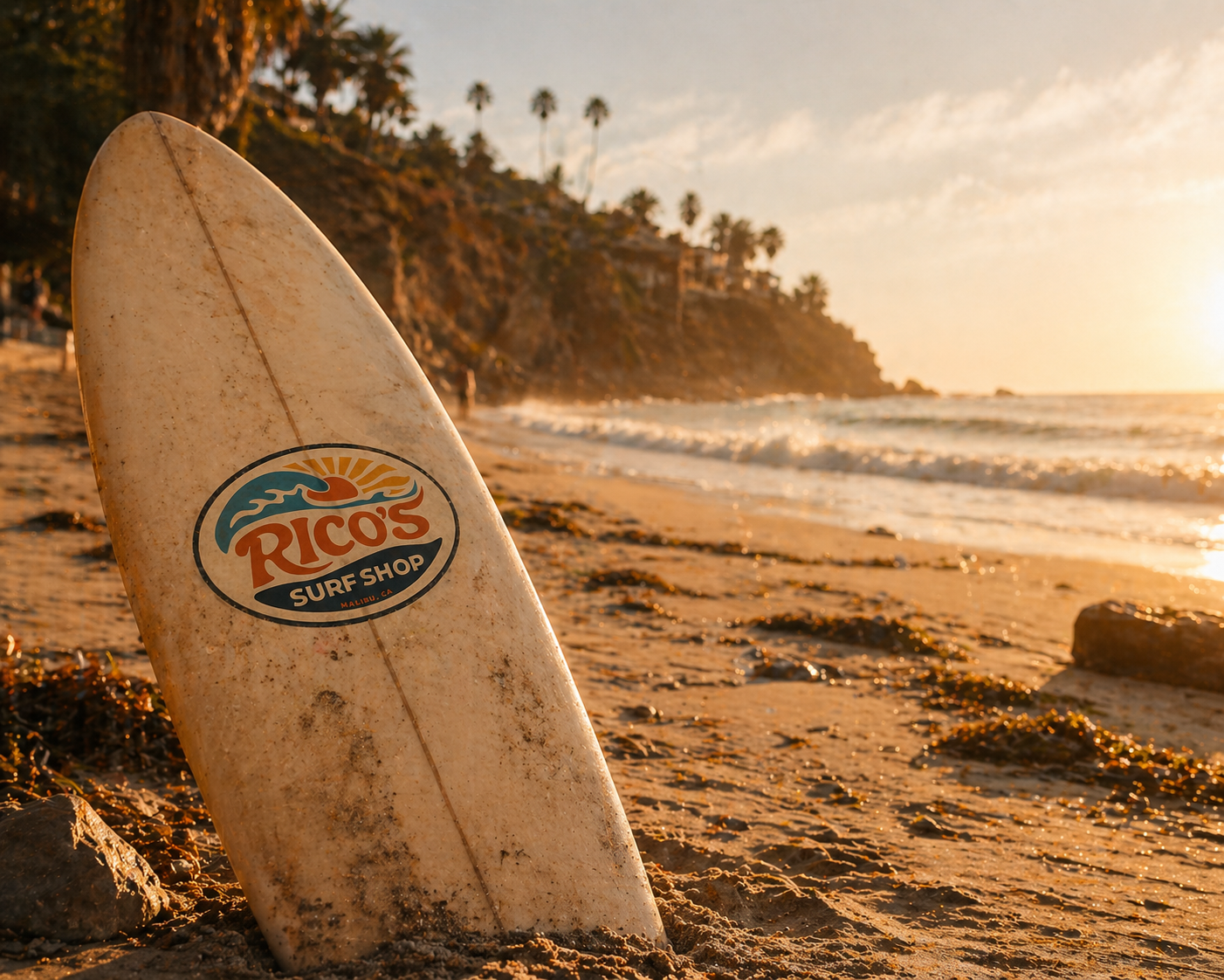
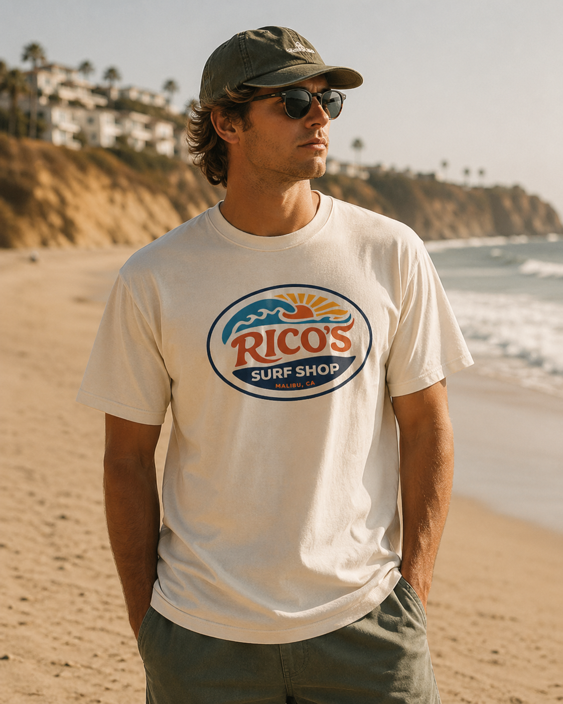
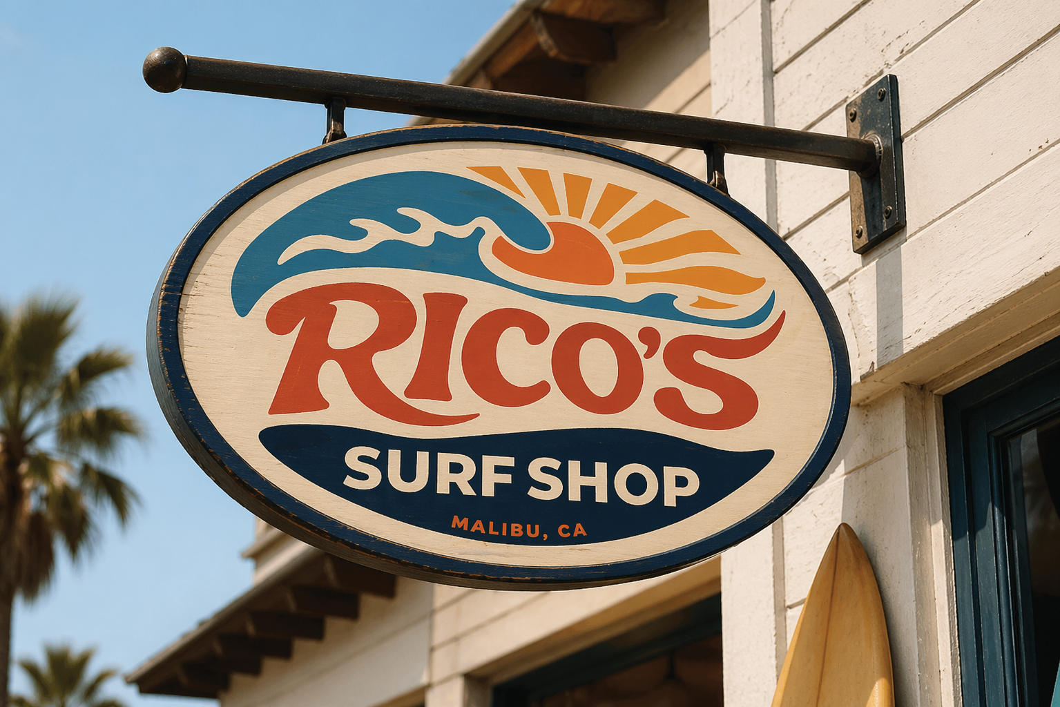
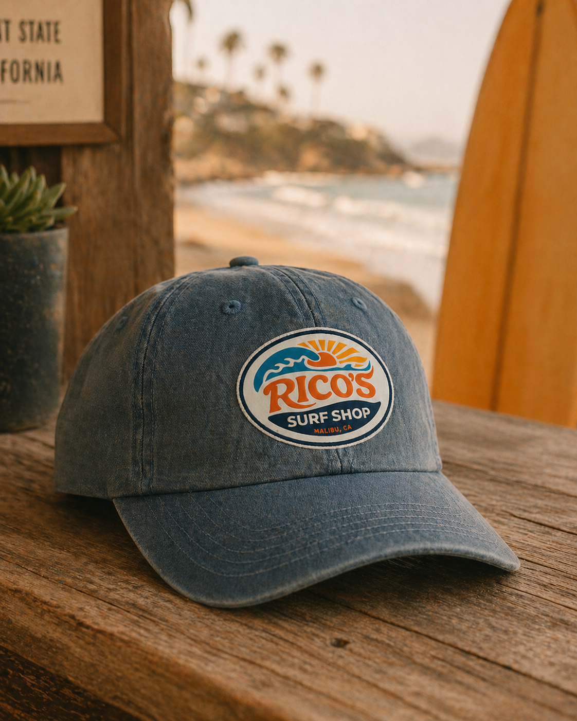
Rico’s Surf Shop Rebrand
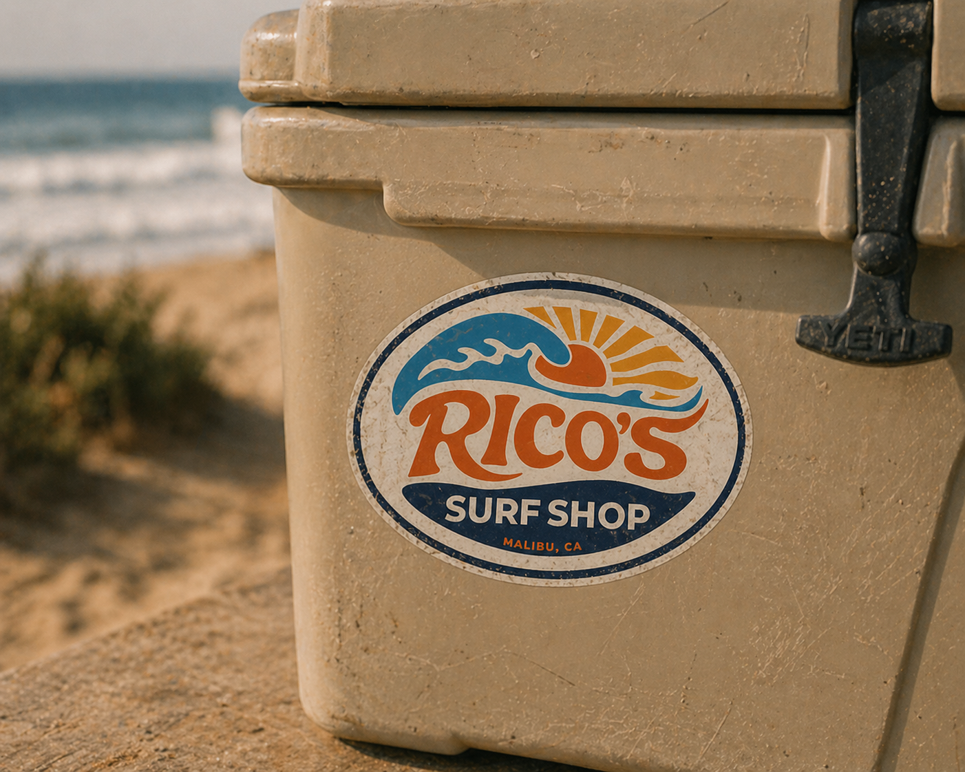
I was inspired to reimagine the iconic Rico’s Surf Shop logo from the show Hannah Montana, a recognizable element of its visual identity. My goal was to preserve the nostalgic familiarity of the original name while evolving the design into a more modern, elevated brand mark. I drew inspiration from Malibu, CA surf shops, where the show is set, and used Adobe Illustrator to create cohesive design elements that form a refined brand identity.
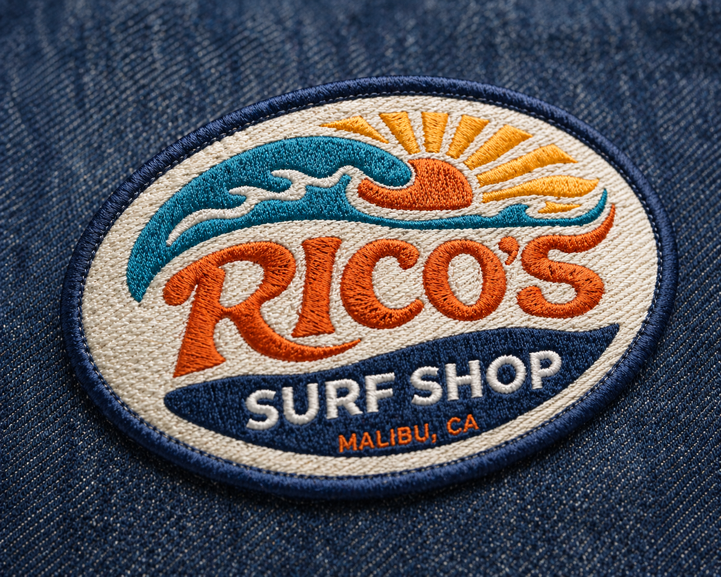
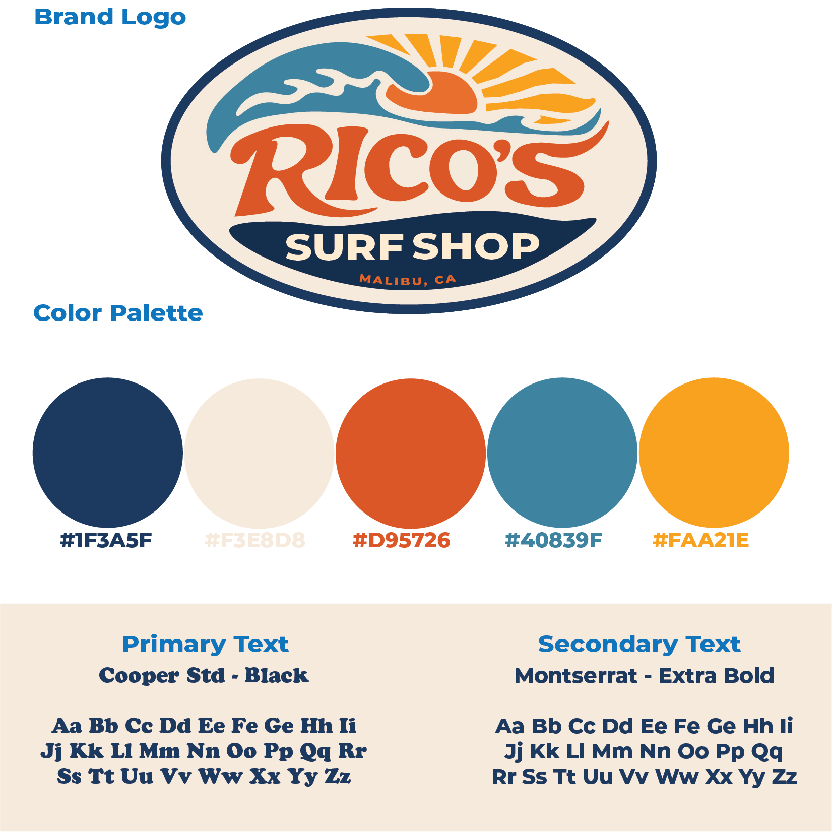
New Logo:
Branding Visuals:
Old Logo:
Process:
I began by constructing the oval base of the logo using the Ellipse Tool, applying a thicker outer stroke and a thinner inner stroke to create depth and structure. From there, I used the Pen Tool to design a custom wave shape that anchors the typography and reinforces the surf inspired identity. This was the most time intensive part of the process, as it required careful refinement to achieve a natural and fluid form.
For the typography, I was initially drawn to the Cooper Std Black typeface for “Rico’s” but wanted to push it further to better reflect the movement of a wave. Using the Curvature Tool, I traced and customized each letter, extending and reshaping the forms to create a cohesive, flowing word mark that seamlessly fits in with the overall composition.